Unreadable micro seat maps
Pinch-zooming 200+ tiny seat squares caused frequent mis-taps on adjacent rows.

Reimagining movie discovery, real-time auditorium seat selection, and frictionless cinema checkout for dark-room environments.
We fixed it.
Most cinema apps bury showtimes behind pop-up ads, force mandatory account registration before revealing available seats, and surprise moviegoers with convenience fees at payment. .Cinema streamlines the entire booking ritual — from watching IMAX trailers to scanning a live QR pass — into an effortless 2-minute dark-mode experience.
We interviewed 16 frequent cinema visitors and observed live mobile bookings to uncover why 61% abandoned mobile checkout in favor of buying at the counter.
Pinch-zooming 200+ tiny seat squares caused frequent mis-taps on adjacent rows.
Users had to create a password and verify SMS before even seeing if two seats together were free.
Booking fees and 3D glasses surcharges appeared only on the final payment step.
Switching between IMAX, Dolby Atmos, and VIP required restarting the movie search.
Opening email PDFs inside dark auditoriums blinded nearby viewers and failed scanner brightness.
Sharing seat numbers and splitting snack combos with friends required manual screenshots.
Mapping heuristic violations across legacy cinema apps gave us eight measurable UX targets.
Average legacy flow took 11 screens from launch to confirmed ticket.
First-time visitors had no hint which rows offered optimal screen angle and sound.
Mandatory multi-page concession menus interrupted urgent last-minute bookings.
Missing one-tap Apple Pay and Google Pay caused 34% payment drop-off.
Users hunted through inbox attachments at the turnstile queue.
Seats appeared open until checkout failed with an expired session error.
Users bounced to YouTube and IMDb to check ratings before returning to book.
Swapping showtimes required calling customer support instead of one-tap self-service.
Benchmarking regional and global cinema apps revealed an opportunity for a speed-first, dark-native booking flow.
• Rich F&B menu • Forced login before payment • Dense seat map on small phones • Multi-step promo validation
• Fast city selector • Separate format listings • Limited seat view preview • Static email barcode
• Strong loyalty pass • Heavy promotional clutter • Extra fees revealed late • Complex navigation tabs
• Guest-friendly live seat map • Acoustic sweet-spot indicator • Upfront all-in pricing • One-tap Apple Pay & live QR
Tariq Al-Harbi · 25 · Product Analyst in Riyadh. Organizes Friday night IMAX outings for 3–5 friends and books on mobile while in transit.
• Lock center-row VIP seats in under 2 minutes • Compare IMAX vs Dolby showtimes on one screen • Send instant wallet passes to friends
• Discovering seats are split only after signing in • Typing 16-digit card numbers in a moving car • Digging through emails at the theater gate
• Watches trailers in dark mode after 9 PM • Pre-orders caramel popcorn combos to skip queues • Pays 100% with Apple Pay
Every screen advances forward with persistent context and zero dead-end modals.
Instant location-aware now-showing feed with zero login gate.
Filter by Tonight, IMAX, Dolby Atmos, or IMDb score.
Inline trailer, verified ratings, runtime, and cast.
Unified date strip and hall format chips on a single sheet.
Smart auto-zoom auditorium grid with acoustic sweet-spot guide.
One-tap combo add-ons with instant Skip option.
Transparent total and biometric Apple / Google Pay.
Perforated dark-mode pass synced to Wallet with hall countdown.
Design principles translating user research directly into interface mechanics.
Let moviegoers inspect real-time auditorium availability before asking for identity.
True obsidian surfaces with calibrated crimson accents protect night vision inside halls.
Date pills, seat confirmation, and Pay CTAs sit comfortably within one-handed reach.
Running ticket + combo totals update live on every tap with zero hidden checkout fees.
Selecting 2 guests highlights contiguous center pairs automatically.
High-contrast QR code auto-boosts only inside the QR square for instant turnstile scans.
Low-fidelity architecture validated tap targets, information density, and flow speed with 8 test users before applying visual polish.
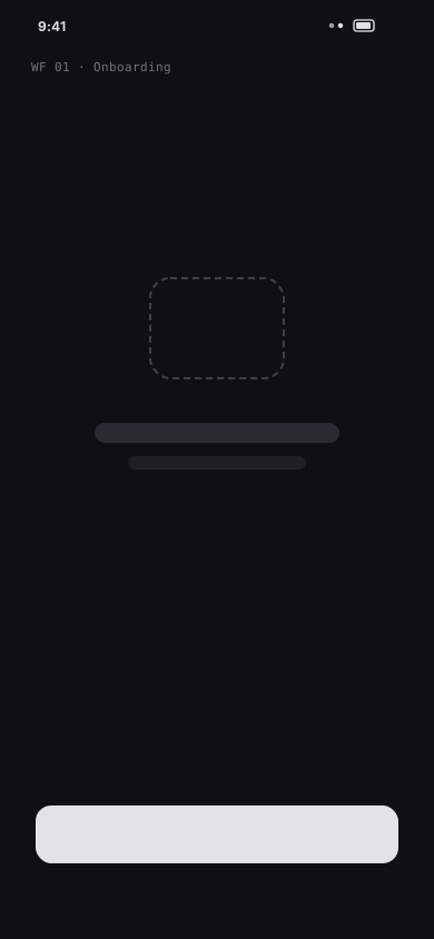
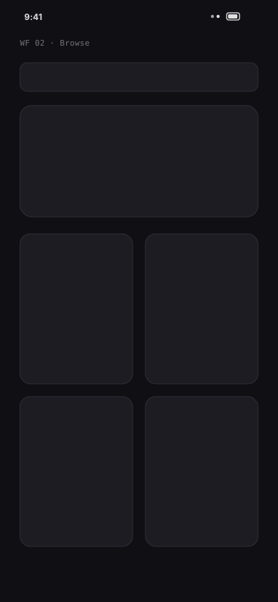
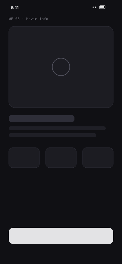
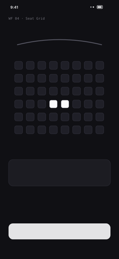
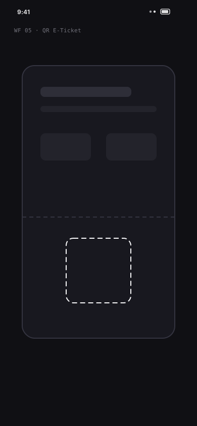
Built around geometric Plus Jakarta Sans display headlines, ultra-legible Inter UI labels, and a high-contrast cinema crimson + obsidian dark token scale.
Ten core screens spanning onboarding, discovery, showtime filtering, interactive seat selection, snack combos, Apple Pay checkout, and live QR pass.
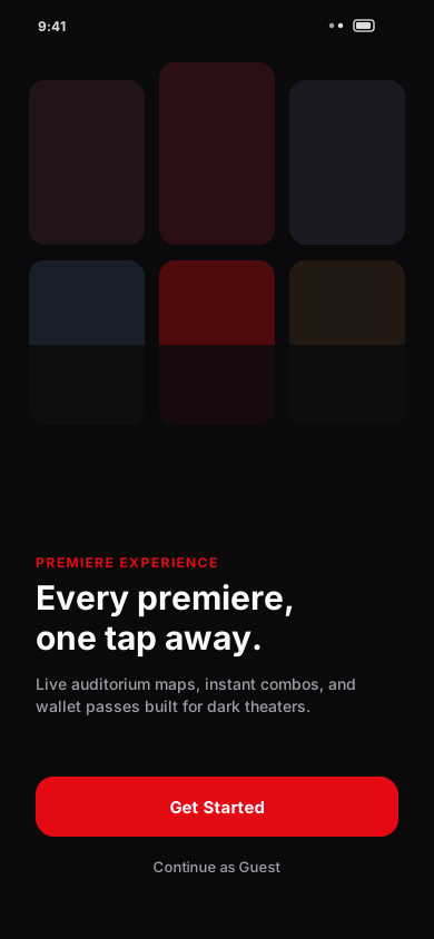
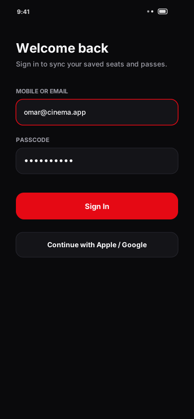
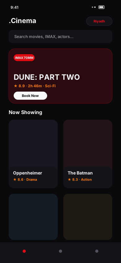
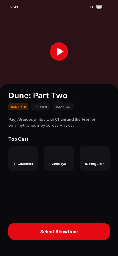
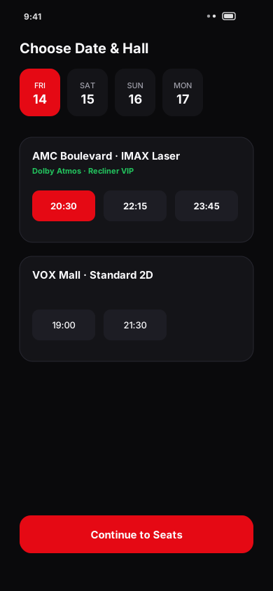
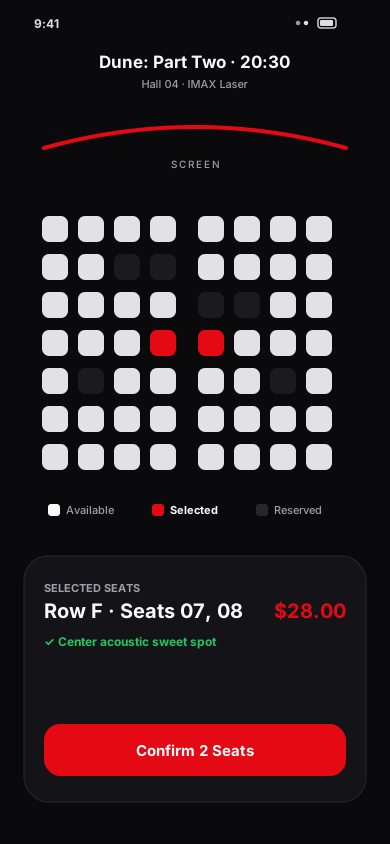
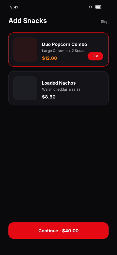
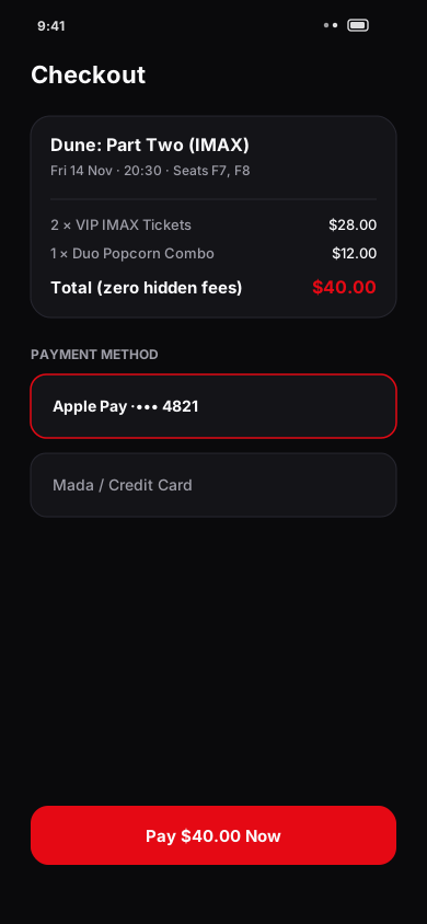
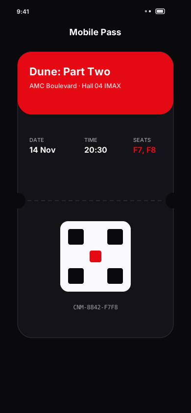
The seat picker was redesigned from the ground up as a tactile, zero-pinch canvas that guides moviegoers to the best acoustic view in seconds.
Moderated usability testing across 12 participants comparing the legacy cinema flow against the .Cinema prototype.
Designing specifically for dim theater lighting made contrast hierarchy and thumb reach far more impactful than heavy visual chrome.
Letting users explore live seats first built immediate commitment before biometric checkout.
Defining semantic status tokens upfront kept seat states, snack badges, and wallet passes unmistakably consistent.
Want to walk through the interactive Figma flows, design tokens, or motion specs?